this post was submitted on 24 Sep 2025
321 points (97.1% liked)
Funny
12491 readers
1503 users here now
General rules:
- Be kind.
- All posts must make an attempt to be funny.
- Obey the general sh.itjust.works instance rules.
- No politics or political figures. There are plenty of other politics communities to choose from.
- Don't post anything grotesque or potentially illegal. Examples include pornography, gore, animal cruelty, inappropriate jokes involving kids, etc.
Exceptions may be made at the discretion of the mods.
founded 2 years ago
MODERATORS
you are viewing a single comment's thread
view the rest of the comments
view the rest of the comments
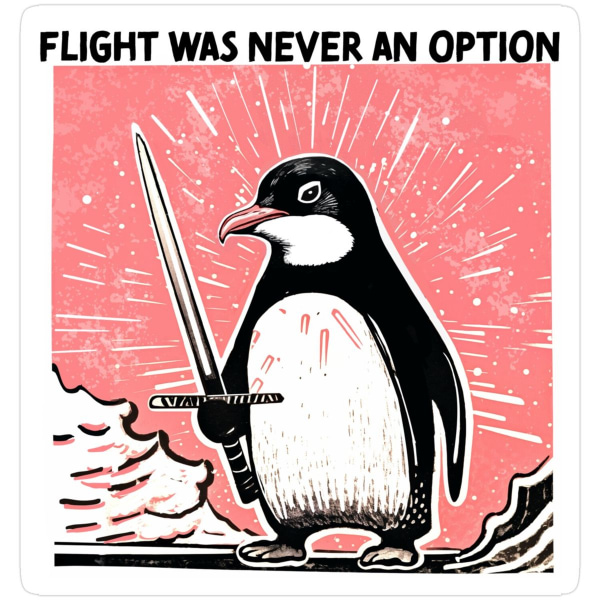
Text and style in some areas give me AI vibes…
The text gave me those vibes at first, but a closer look makes clear it's actually a font that is intentionally misaligned. The As, Ns, and Es look exactly the same as each other, in a way that doesn't happen with hand lettering or even AI generated text. The bad spacing around each character is consistent, too. It just looks like a poorly designed font.