this post was submitted on 22 Aug 2025
217 points (96.2% liked)

People Twitter

7987 readers
2235 users here now

People tweeting stuff. We allow tweets from anyone.

RULES:

  1. Mark NSFW content.
  2. No doxxing people.
  3. Must be a pic of the tweet or similar. No direct links to the tweet.
  4. No bullying or international politcs
  5. Be excellent to each other.
  6. Provide an archived link to the tweet (or similar) being shown if it's a major figure or a politician.

founded 2 years ago
MODERATORS
top 50 comments
sorted by: hot top controversial new old
[–] VitabytesDev@feddit.nl 4 points 1 hour ago

As a European, I don't know what Cracker Barrel is, and I couldn't care less.

[–] Edgarallenpwn@midwest.social 2 points 2 hours ago* (last edited 2 hours ago)

During lockdown my team was "mandatory local support" so we got take out lunch paid for 2 days a week day. Friday was cracker barrel day since it was close and filled us up enough for an "average Friday workload". Mainly lazy days not wanting to get out of chairs due to "CB gut". Cracker barrel will forever be "cinder block gut" to me now.

But ehh, another dumb rebranding freakout that doesnt matter. You are still buying slop to go in your belly.

Edit: Cracker Barrel was my shit when my family would do road trips. On one we drove past the state capital and my dad said "hey look at it!". There was a cracker barrel roadsign on the highway and I screamed out "let's get cracker barrel!"

[–] Nomad_Scry@lemmy.sdf.org 15 points 5 hours ago

I have no idea if this actually matters but, as a former printer, the new logo is easier and cheaper to produce. The print plates will be cheaper and the lack of thin lines mean it will be more durable too. The wide open spaces mean that the alignment between the brown and orange doesn't need to be perfect anynore (less waste).

It might be a terrible design for a logo (I don't know, not my area) but it's a good design for printing.

[–] froggycar360@slrpnk.net 6 points 4 hours ago (1 children)

It’s not just the logo, they’re remodeling the inside to be more “modern”. The kitschy americana vibe was the only reason people go there.

[–] ricecake@sh.itjust.works 7 points 2 hours ago

According to people I know who worked in the kitchen there, the correct reason to go to cracker barrel is actually their biscuits and gravy.
The cheapest way for them to make 'em is from scratch. Everything else is premade bags and mixes, but the biscuits and gravy are made fresh a few times a day.

[–] Wahots@pawb.social 2 points 3 hours ago

I don't mind it, CB's food ain't great either, though.

[–] chellewalker@lemmy.ca 15 points 6 hours ago

This isn't "woke", this is the corporate trend of oversimplifing logos no matter how much people liked the old ones.

[–] lowleekun@ani.social 48 points 8 hours ago

Another chapter in "Everything i do not like is woke"

The new design is minimalistic slop, for sure. But why would i give a fuck about a companies logo. Honestly we should not even be reacting to this bait.

[–] ddplf@szmer.info 64 points 10 hours ago (2 children)

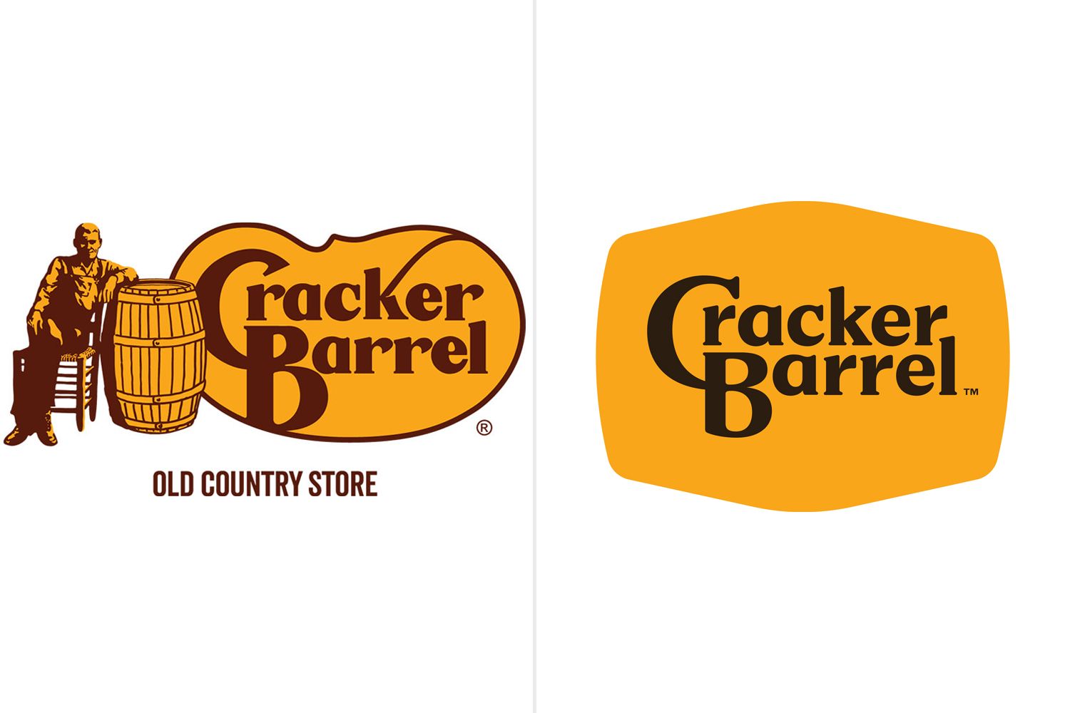
Cracker Barrel Remodel - Old vs New

I'm not an American and I've only seen this logo a couple of time but I'll be completely honest - this remodel fucking sucks.

I despise minimalism and these transitions from oldschool cool to these post-modernist corporate garbage. And that's definitely one.

[–] cupcakezealot@piefed.blahaj.zone 8 points 6 hours ago (3 children)

what that's why everyone is bitching about it? like THAT?? how is that "going woke"? i guess woke is when you sans-serif.

[–] Catma@lemmy.world 8 points 4 hours ago* (last edited 4 hours ago)

Its woke because they took the cracker off. They are erasing crackers

[–] ddplf@szmer.info 3 points 6 hours ago (1 children)

I never said it's going woke, don't throw me into that box.

i didn't say you were; i was referring to everyone on twitter claiming it was

[–] funkless_eck@sh.itjust.works 2 points 6 hours ago

I mean it still has serifs its just losing the old guy, the barrel, the outline and the flourish on the K

Honestly, I can see why an old guy with his hand in a barrel might be off putting for a restaurant theme

[–] OhShitSon@lemmy.zip 5 points 7 hours ago

I hate it as well, my theory is that it's done for better readability on small screens such as phones.

weird way to brag about getting a blowjob in the parking lot but whatever i guess

[–] tigeruppercut@lemmy.zip 13 points 8 hours ago

New logo blows. Cracker Barrel food is a quarter step above pig slop.

fin

[–] dharmacurious@slrpnk.net 39 points 11 hours ago* (last edited 11 hours ago) (4 children)

I'm confused. The new logo is great, or it's shit, I don't care. But what does it have to do with wokeness? Did the old man sitting by the barrel start sucking dick on the billboard? Has he transitioned? Does the new logo secretly spell out black lives matter in invisible ink? It's just the name in a sort of blob? How is this political? What am I missing here?

[–] bytesonbike@discuss.online 2 points 4 hours ago

Snowflakes getting their feelings hurt because pictures change

[–] stray@pawb.social 7 points 8 hours ago (1 children)

Perhaps he feels the original logo depicted a white cishet male, and thus the new one is erasure.

[–] Madison420@lemmy.world 3 points 8 hours ago (2 children)

Come-on everybody knows that barrel is full of dildos pickled in anal lube.

[–] SkaveRat@discuss.tchncs.de 1 points 5 hours ago

No, that would be my nightstand drawer

[–] cupcakezealot@piefed.blahaj.zone 1 points 6 hours ago* (last edited 6 hours ago) (1 children)

and where might i find a cracker barrel so i can know to, uh, avoid it and get directions away from there.

[–] Madison420@lemmy.world 1 points 5 hours ago

They chain the barrel like they chain the rocking chairs, dudes freaky af for sure.

[–] hovercat@lemmy.blahaj.zone 14 points 10 hours ago* (last edited 10 hours ago) (1 children)

But what does it have to do with wokeness?

See this handy guide for the way these dipshits think.

[–] brygphilomena@lemmy.dbzer0.com 1 points 6 hours ago

At this point it's just that a thing changed from "back in my day."

[–] ArchmageAzor@lemmy.world 7 points 10 hours ago

Woke doesn't mean anything specific more, it just means "thing I don't like." So when somebody says they want to end wokeness, they mean they want to remove everything they don't personally approve of.

[–] Clent@lemmy.dbzer0.com 17 points 11 hours ago (1 children)

Conservatives crying buckets of tears over a corporation's new logo is my kink.

[–] vzqq@lemmy.blahaj.zone 3 points 6 hours ago

The heraldry of corporate feudalism is no laughing matter for capitalist serfs.

[–] sunoc@sh.itjust.works 63 points 16 hours ago (14 children)

Wtf does « gave my life to Christ » means in that situation? Did mf get baptized in the parking lot??

[–] Nasan@sopuli.xyz 1 points 2 hours ago

Maybe it rained a lot and dumpsters were water tight back in his day.

[–] kureta@lemmy.ml 6 points 9 hours ago

Can someone seriously answer this question. I'm losing my mind over here. WTF does it mean?

[–] RizzRustbolt@lemmy.world 26 points 13 hours ago

Swallowed for the lord.

[–] Quill7513@slrpnk.net 59 points 15 hours ago (2 children)

i think he gave a life altering blowjob in that parking lot

load more comments (2 replies)
load more comments (10 replies)
[–] HootinNHollerin@lemmy.dbzer0.com 71 points 17 hours ago (11 children)
[–] abcdqfr@lemmy.world 33 points 15 hours ago (2 children)

Lmao they got rid of the cracker and the barrel

load more comments (2 replies)
[–] WolfLink@sh.itjust.works 47 points 16 hours ago (4 children)

Tbf the old logo is much better

[–] Pyr_Pressure@lemmy.ca 2 points 4 hours ago

Yeah, I think so too. I don't see why they had to change the font, at least the C had character. Now it's the most boring plain forgettable font imaginable and black at that. It's like they didn't even try.

load more comments (3 replies)
load more comments (9 replies)
load more comments
view more: next ›