this post was submitted on 19 Aug 2026
196 points (98.5% liked)
Microblog Memes
12022 readers
3359 users here now
A place to share screenshots of Microblog posts, whether from Mastodon, tumblr, ~~Twitter~~ X, KBin, Threads or elsewhere.
Created as an evolution of White People Twitter and other tweet-capture subreddits.
RULES:
- Your post must be a screen capture of a microblog-type post that includes the UI of the site it came from, preferably also including the avatar and username of the original poster. Including relevant comments made to the original post is encouraged.
- Your post, included comments, or your title/comment should include some kind of commentary or remark on the subject of the screen capture. Your title must include at least one word relevant to your post.
- You are encouraged to provide a link back to the source of your screen capture in the body of your post.
- Current politics and news are allowed, but discouraged. There MUST be some kind of human commentary/reaction included (either by the original poster or you). Just news articles or headlines will be deleted.
- Doctored posts/images and AI are allowed, but discouraged. You MUST indicate this in your post (even if you didn't originally know). If an image is found to be fabricated or edited in any way and it is not properly labeled, it will be deleted.
- Absolutely no NSFL content.
- Be nice. Don't take anything personally. Take political debates to the appropriate communities. Take personal disagreements & arguments to private messages.
- No advertising, brand promotion, or guerrilla marketing.
RELATED COMMUNITIES:
founded 3 years ago
MODERATORS
you are viewing a single comment's thread
view the rest of the comments
view the rest of the comments
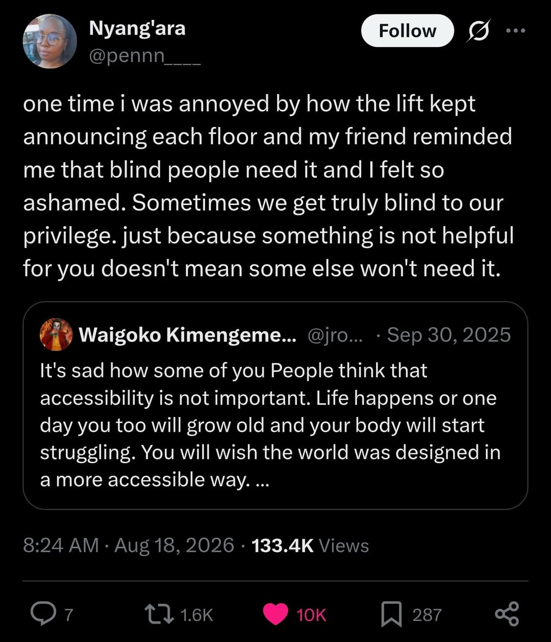
I try to implement color-blind safe color palettes in my presentable work. Weird part is i started doing it after a color blind person was an ass to me for completely unrelated reasons.
Maybe I thought other color blind people are just humans and not represented by this guy.
This is why, if I want to upload an image that needs a circle drawing attention to some part of it, I use blue instead of red. Useless red circles become even more useless when someone struggles to see red, but the most common forms of color-blindness show a distinction for blue.
I have an app on my phone that simulates different types of color blindness (Chromatic Vision Simulator, or CVSimulator. Free, no ads, it just does the thing it's designed to do.) Sometimes I use it to make art that can be accessible for people without a full range of color perception, or to make something that is designed specifically for them. Sometimes such limitations encourage creativity, and if it means more people can enjoy a piece, I'm all for it.
Don’t use color, use different line types. Hatching, cross hatching, zig zag, dotted line, dashed line.
Interesting, what is the app called?
Had this the other day with my NAS!
Just for fun I tried the "locate disc" function, which supposedly changes the colour of the LED of the tray of the specific disc.
Only after manually finding the correct tray and starring at the LED for a couple of seconds I could see that it was slightly oranger compared to the others. I think.
I do hate the blinkinlights for that reason. Green? k. Amber? Not quite the same as green... is there a green nearby to compare? Orange? Different than amber, maybe? Red. K definitely not green.